Graphic Design Rules - Part 3
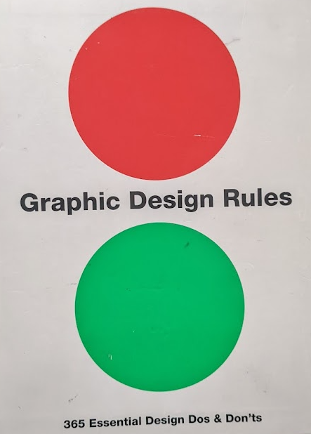
This book written by Sean Adams, Peter Dawson, John Foster, and Tony Seddon they outline 365 rules for Graphic Design that act to help the first-time designer to make sure they gain an understanding for Design and what is needed to be "good" in the field. However, when reading it I began to think about why we need all these rules that essentially box us in and tell us how we are meant to be and how we are meant to design.
The first rule they start with of course is about Comic Sans and that we shouldn't use it as a Graphic Designer the point out that it is used for "home-grown" party invites and letterheads, in a scoffing manner saying that we as designers are above this sort of design. But I would argue differently that there is nothing wrong with the use of Comic Sans especially in that of "home-grown" designs, that is probably where Comic Sans is the perfect font to use, no other font would work as well. Why should we stand on a pedestal and look down on a Christmas Card created by someone who just wanted to make something made by them from them to someone special, they wouldn't want to go to a designer and pay money for something that just happens to use Helvetica as that is a more "accepted" font. Why do we as designers have to box ourselves into these rules and tell ourselves there is only one way for creating something, it seems for me to be creatively stifling to only be able to do something one and one way only.
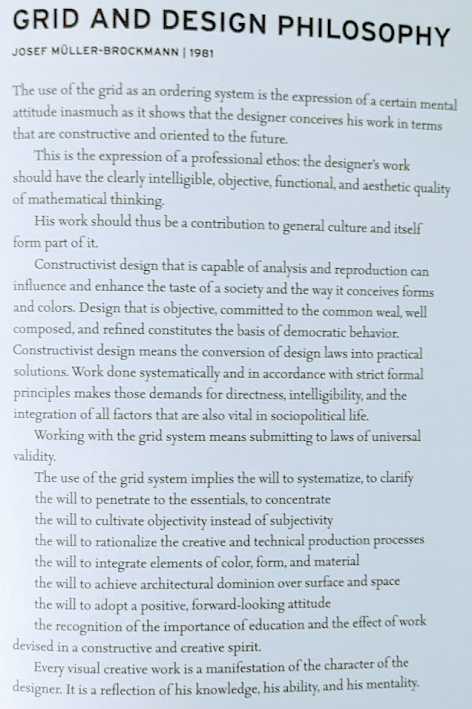
The more I read these "rule" books the more I begin to hate the idea of creating something that follows them, I want to try and break away from this I want my designs to be somewhere else, away from all this "box-ticking". I should try and break away from this but to do this I must first understand what rules and methodologies I am following that I am unaware of.
Graphic Design Rules: 365 essential design dos and don'ts: Adams, Sean. London: Frances Lincoln, 2012.


Comments
Post a Comment