Continuing my methodologies
Continuing to investigate my methodologies I decided to make another poster however this time I would try and steer away from using grids, leaning on already comfortable design styles such as swiss design, and just try to push myself further to create a poster in 5 minutes. This is what I created...
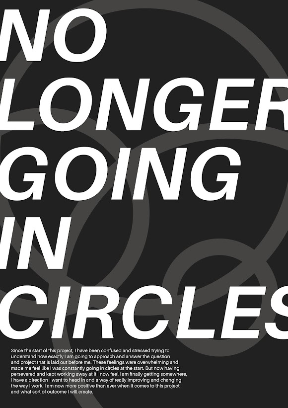
As you can see I found it very hard to move away from the swiss style of design or even design without a grid, when you watch the video of me designing this you will see that while I didn't first create a grid I feel I still used one, just one that was in my head and forced me to design like this. While I know grids are important and help to make a design more readable and better for the reader I just wanted to see if I was able to do it without and what it would look like. As it turns out I can still design without a grid by creating a grid in my head. I think this is both a good and a bad thing, while I may not be able to let myself go free with my designs at least I know that I have some sort of eye for keeping my designs within the system.

Comments
Post a Comment