Analysing Myself


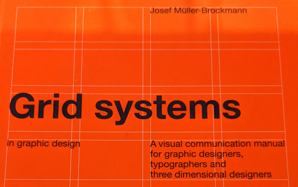
The first thing I do is to copy the type in and then lay out a grid system for the design, I first learnt about grid systems in the first year of my BA. Here we were taught to use a grid system in our designs to effectively lay out a page and have the type look correct and fit into a overarching system, I have already looked at Grid Systems in this blog but it is interesting that I have learnt to use this and now almost am unaware I am using it. A page in the designing stage would look strange without a grid system in it, I am that aware of grid systems now that it feels odd not to see one.

Another thing I noticed was that a lot of my go to design work happens to draw a lot of inspiration from Swiss Design work, with the small type blocks in at the bottom of the page and large block colours with large type interacting with it. It's strange that I lean so heavily on this style of Graphic Design, is it because I know how to easily create this sort of style and that most of the time it looks pretty good and works well for what I want to create. It may be interesting now to try and take this poster and radically change the style that I am using, will it make it harder, will it change the feel of the poster or will it make my design process better. Along with this maybe I could try and create it without a grid system to see what will happen then.

Comments
Post a Comment