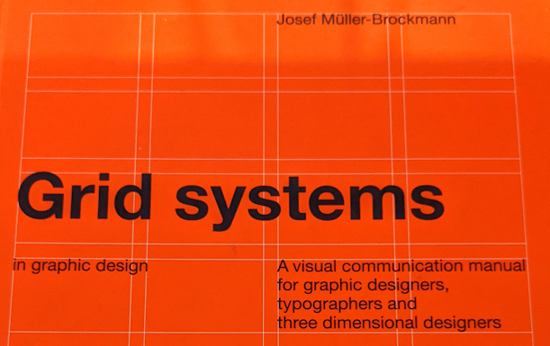
No More Grids

This time I tried my hardest to design without a grid, going so far as to focus the design itself on "Disregarding grids", much like with the previous design I at first started designing in a grid even if there wasn't one there. However, I caught myself and pushed myself to break this, putting the type at odd angles and working with it in massive size. Along with this I also didn't have a big block of text to design around and ultimately I feel like this made the design process and design overall much worse, I find it so much better and easier to design around a block of text it allows me to understand how the audience is going to look at the design and how the rest of it will sit.
Thinking about how I find it easier to design with a block of text on the page and working to a grid has made me start to think about why I feel I need to stop doing this, what is exactly wrong with it? I think it was much more interesting when I was looking at my own methodologies and what happens automatically, it allowed me to really unpack what I am as a designer. I think instead of trying to push myself away from this I should look further into what I do automatically and how it helps me to create my designs.

Comments
Post a Comment