Posts

Showing posts from November, 2021

Drawing Part 2

Image
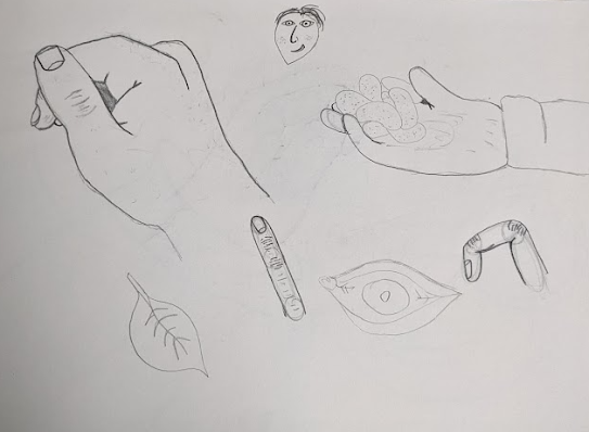
In my drawing practice I am now still working on the human anatomy, still focusing on the hand, within these pages there are some good drawings of the hand but I'm still not that happy with it, it feels a bit too round and cartoony not really what I wanted. But maybe this is what I should be trying to look for, not creating something real and life like but more what I am comfortable drawing and creating in my own style. Something that I am HAPPY with, not something I think other people will like. Taking this idea I then decided that it may be better for me just to doodle, so I did that and let myself just draw what came to into my head. I feel this is where I have made a bit of a breakthrough in my drawing technique, while I still think its a bit amateur, I just need to keep drawing to improve this!, I feel my confidence in myself is beginning to grow and I trust myself more to be able to transfer what I am thinking down onto the page.   This small doodle of someone shouting "

1 to 1 meeting

Image
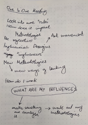
 Today I had a 1 to 1 meeting with my Tutor, before going to the meeting I wasn't too sure what I was going to need it for as I felt I knew what I wanted to do and where I was going next with this project. However, once I joined the zoom call and began to talk through my project I got some good ideas and steps I should do next. In my notes, you can see how we were talking about looking more into the methodology and rules that are laid out by other Graphic Designers/Thinkers in the creative field and how these influence Designers. Along with this while talking about how these new methodologies begin to impact and change the way Graphic Designers produce pieces of work, we begun to talk about looking at the rules that I use inadvertently when making a piece of design. This where we talked about me making something and then analysing what "rules" and methodologies I have been using and been unaware of using. In order to do this I need to first set out what I will create and

Drawing - Part 1

Image
  From looking at the illustration books it mentioned that to get better at drawing you needed to first have an understanding of human anatomy and how the body looks, so this is where I will start. I want to follow their process to see if it can indeed improve my drawing skills and make me better at illustration, starting with the body felt odd to me as I had never done that before so I will start with the hand and see how good I can get at doing that. These are my first attempts at drawing a hand just from a reference image of my own hand, I think it's a good start but you can really see how I need to keep practising at this as the drawings are just not that strong and not where I want them to be.

Improving Myself

Image
 Recently we had a seminar that really helped me to understand what I want to do for this project and how I should approach my answer to the question, it was a really interesting lecture that opened my eyes not only to this project but to what I actually want to do for my Masters. Within the lecture, we were shown videos of a skater practising over and over again until finally he get the trick right and a road line painter perfectly painting the words "BUS STOP" on the road, it shows the real importance of practice and how you can practice over and over again until you become a master at your craft. This is what I should be seeing my Masters as, a year where I can practice over and over again until I become a master at my craft.  These are some of the questions that I wrote down in my notebook during the seminar that I think is very similar to the question I'm trying to answer in this project, one that is very similar to my project question is "How does it affect wha

Project Update - 2 - Story

Image
  Today we had a lecture where we had to create a story for how we are feeling about the project so far, I think the first two lines sum up exactly how I feel currently that being "Fucking Stressed"(sorry for swearing but it gets the feeling across better). I believe the stress to be coming from not knowing if what I am doing is correct, is this the right thing to be doing or is it a stupid idea that I can't use properly, along with this I also wrote about how I'm currently feeling like I'm spiralling downwards which is partially true. As I feel more like I'm repeating myself over and over again constantly looking into the same things and not really getting anywhere with it. I'm currently writing this in-between my lecture and seminar with the seminar happening next, hopefully, in this seminar, some things can be cleared up and I'll be able to understand what the hell I should be doing.

Guerrilla Girls Manifesto

Image
  While the Guerrilla Girls "manifesto" isn't really a manifesto I still think it's interesting and useful for me to look at. I actually think this is a better form of a manifesto as it doesn't tell the reader what they are meant to be doing, rather it gives some information across. I think really this is about me getting annoyed looking at all these theory book and manifestos and feeling like they are telling me how to be and what to do. I think I need to move on and do something else.

More Graphic Design rules

Image
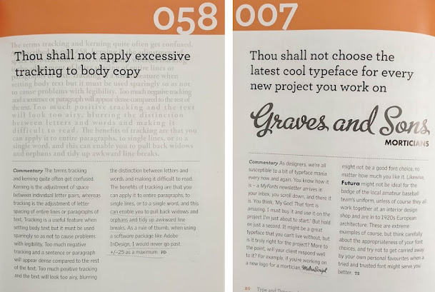
  I decided to look at more pages within the book as simply flicking through it and stopping on some pages had created this strong emotion within me that made me want to see what else is written within the book. Like with some of these pages I've shown above, I just get this feeling where it's restricting and trying to force someone to do something they wouldn't do when designing or stifling their creativity. Like with the pages about using excessive tracking and negative letter spacing, yes I know it's not exactly perfect for design with type and can reduce readability but what if it helps with creativity. Maybe something within a body of text could be pushed further and improved with adding more tracking or reducing the letter spacing, just because it's not seen alot doesn't mean it's against the "rules". This is where my anger towards this book is coming from, the feeling that I am being restricted by it and told "no you can't do that,

Graphic Design Rules - Part 3

Image
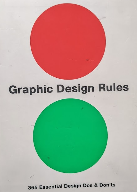
  This book written by Sean Adams, Peter Dawson, John Foster, and Tony Seddon they outline 365 rules for Graphic Design that act to help the first-time designer to make sure they gain an understanding for Design and what is needed to be "good" in the field. However, when reading it I began to think about why we need all these rules that essentially box us in and tell us how we are meant to be and how we are meant to design.  The first rule they start with of course is about Comic Sans and that we shouldn't use it as a Graphic Designer the point out that it is used for "home-grown" party invites and letterheads, in a scoffing manner saying that we as designers are above this sort of design. But I would argue differently that there is nothing wrong with the use of Comic Sans especially in that of "home-grown" designs, that is probably where Comic Sans is the perfect font to use, no other font would work as well. Why should we stand on a pedestal and look

Our Book

Image
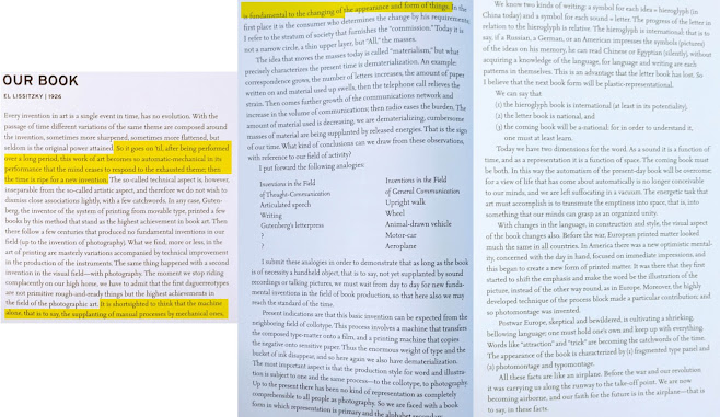
  I also found a manifesto from one of my favorite designers, El Lissitzky who founded the constructivist art movement in soviet Russia. I never knew he wrote a manifesto of sorts that was for constructivism, this would have come in handy last year when I did an essay on the art movement. What I like about this is that Lissitzky talks about creating something automatically, that artists/designers have a way of doing something that is done without them being fully aware. Perhaps this is how constructivism was created?  The more I read these manifestos the more I'm finding myself fascinated with how they are written and how they came to be written, it might be interesting for me to try and attempt to write my own manifesto? what it would be about I have no idea but it could be an interesting way to research something. Graphic Design theory: readings from the field. Armstrong, Helen. New York: Princeton Architectural Press, 2009.

Graphic Design Rules - Part 2

Image
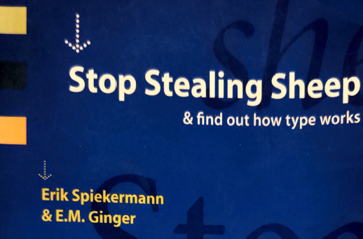
  The next book I looked at was "Stop Stealing Sheep" by Erik Spiekermann and E.M. Ginger, much like "Grid Systems" this book aims to be a teaching application for Graphic Designer so they can begin or fully understand the basics of Graphic Design that is the use of type and layout. However, unlike "Grid Systems" which I felt was written so if a designer doesn't use the techniques outlined in the book they are not a Graphic Designer, this book gives advice and points out where designers go wrong with type. Here for example where the type starts being really close to the rest and bunched up and then starts to move away from each other. I think this is a really good way of showing how to design with type and what pitfalls a designer can fall into. However I'm just not sure this is going to help me in answering the project question, I think focusing more on manifestoes and what rules they create would be more interesting to me and answer the question

Project Update - 1 - Still Starting

 I know this is still the start of the project but I feel like this is a good place to do a bit of self-reflection, I have started to do some readings into design theory, having broken down the question and focused on this idea of "rules" within Graphic Design I got some books out of the library looking at Graphic Design theory that being Grid Systems which I know a lot about and The Futurist Manifesto as I felt they fit well into this idea of looking for "rules" in Graphic Design.  I really like this idea of looking at both Design theory books and Manifestos from within the art history, as I think they could give me different insights and perspectives when it comes to answering the question. In relation to answering this question, I feel more and more like I should try and create a final piece for the project that can in some way answer the question. I'm not sure what this could look like yet but I think it's a good way in which I can apply what I learn dur

Design Philosphy

Image
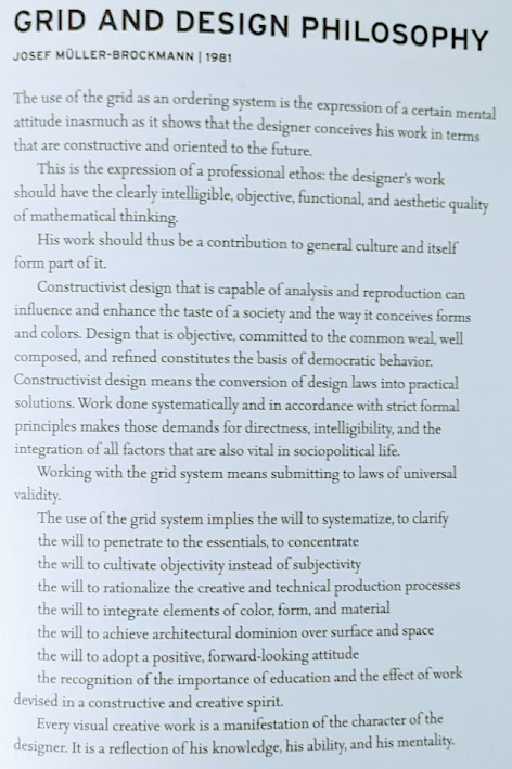
  This reads a bit like a manifesto to me so I thought it would be good to look at, it was written by Joseph Muller-Brockmann and focuses on his use of grids and the philosophy of design. I quite like this manifesto as it focuses on the idea of making the design as clear and readable for the audience as possible, he says that using his grid system will mean you apply to "laws of universal validity" which seems a bit forceful really. While I believe the grid system that Brockmann created and is now used by most designers is incredibly useful and good for design, this idea of using them to obtain validity is wrong to me in some way. I think design is more about being creative so why should we, excuse the odd pun here, box ourselves in by keeping to this ruleset. At the end of this Brockmann writes that "every visual creative work is a manifestation of the character of the designer" this again I agree with wholeheartedly and I think even goes against what Brockmann is

Manifesto - Futurism

Image
 The first manifesto I thought about looking at was Futurism, having done a project on the Manifesto in the second year of my BA I think this will be a good place to start with looking at the rules they create. The manifesto is basically a story about how the futurists came up with their manifesto and problems that happened along the way, it talks about cars speeding along the road and crashing drinking, mud, and factories which all serve to create an image of the world the futurist want to create, however halfway through the manifesto F.T. Marinetti calms down and lists out the manifesto itself. He writes down 11 "rules" in the futurists must follow for them to be futurists  The rules that the futurists created are meant to be followed by their artists, designers, and followers. But I cant get the feeling that this might have stifled their creativity. It's like they are being told to design in only this set way and that no other way is correct except their way, is this t

Graphic Design Rules - Part 1

Image
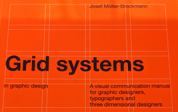
When I started thinking about rules within Graphic Designer I instantly thought of "Grid Systems in Graphic Design" by Josef Muller-Brockmann, I remember starting my BA in Graphic Design and being told to look at this book as it would help us to improve our designs. Within this book Brockmann sets out a design system in which designers can work their type and designs, it creates a rule set in which a designer can find a way to create a grid system that can work for them and their designs along with how to use the system and what it can achieve. When looking at just the start of the book where Brockmann introduces the idea behind the grid system he is about to lay out, he uses this set of words repeating the phrase "the will to" implying, at least to me, that a graphic designer must use these rules to "cultivate objectivity", "rationalize the creative" and "penetrate to the essentials". It’s s as if without these rules a designer cannot