Posts

My Final Post

Image
For me this project started off as something that I felt would be completely theory-based, I thought I would end up looking a bit at my past work but not this much. This project quickly turned into something very personal to me as I started to do all these parts of the project I found myself doubting, trying to push past that doubt, doubting again, and then deciding to grow and remind myself that I do know what I am doing.  I am very glad that this project turned into such a personal one as I feel what I learned here will help to improve the way I work and trust myself in the future, I can use the book I made as part of this project (even though we were not tasked to create something) to act as a constant reminder for myself. I think this is probably the strongest part of this entire project, the personal aspect that grew in it I feel it has propelled it into something different for me. This project allowed me to see the way I work in a way that I have never been able to before, I'

Finishing my book

Image
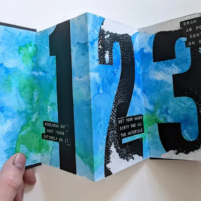
To create the book I took the pages for the book and started by creating the background using the water and crepe paper technique to produce it, once this was sorted and dried I then decided that it would be best to create the pages of the book with screen print as I know this best and understand how to use it effectivly. Along with this I decided to have the type in the book to be written with my label maker, firstly because I like the way it looks and I think it connects well to this idea of this being personal as I would be doing this myself rather than having done with type which while written by me it still has this form of disconnect that I dont really like. These are the practice prints I started with for the book, I really like this look of these huge numbers that fill up the page I think it looks really good. This is the final book, the most obvious thing with this book is the big rips in the pages along the numbers, this happened when I put the book in a book press without fu

Making Something...

Image
I now know how I want the book pages to look I now need to work out how I will bind it and produce it as this could quite easily change how I want the design to look. The first way I thought about binding would be with screw posts, I learned about this sort of binding in the third year and I know it's pretty easy to do and not much waiting around for glue to dry straight so this could work quite well. Along with this, it makes quite a nice book however, I think I want to go for more of an interesting look for the book. While this makes it look good I just don't think it's interesting enough nor would it be easy for me to quickly look at. I like this idea of being able to quickly look at all these reminders I've written for myself when I need the reminder, the way I could do this is with something that folds out. So I would be able to flick between the pages and fold it out to see all the reminders/rules in one go, I just think it would look better and work better for th

Making something?

Image
I know now that I want to create a hand book that I can use in the future that reminds me that its okay to mess up, be doubtful but ultimately that only I know how to create. However I need to first know what this is going to look like and how it will work, like in my other projects I found that sketching out initial designs helped a-lot to first starting thinking about how the design and item is actually going to look like and secondly to start on it otherwise it would take me too long to do this. These sketches were really useful as straight away you could see I was leaning more toward the idea of the type taking up the entire page, filling it with what I need to remind myself is okay. Rather than keeping that important part small and out of the way on the page. I especially like it when the number is large on the page with the type near it, it works pretty well and helps to remind myself that these rules are important for me to remember.   I took this idea of the large number on the

Allowing myself to think and be myself

 Because I know I want this handbook to be for myself and to help me understand how I am creative and approach a project I think I need to write down exactly what I want to include in the book as the "rules", I want them to be partially about my way of approaching a project and how I am creative. I also want to include some reminders to myself as I think they will be helpful, throughout this project I've been very doubting of myself and I want to at least remind myself that this is okay and everything I am doing is correct and works for me. Rules for the book 1# Gain a base level of understanding, dissect the problem bit by bit until you understand it.  2# Always use mindmaps of lists to get ideas out and into the open, don't be afraid of an idea. 3# Research in-depth, keep looking deeper and deeper into something until you think you have everything then look again. 4# Take inspiration from anything, look at books, the internet, film, and tv. Anywhere you can find ins

What I do Automaticaly

Image
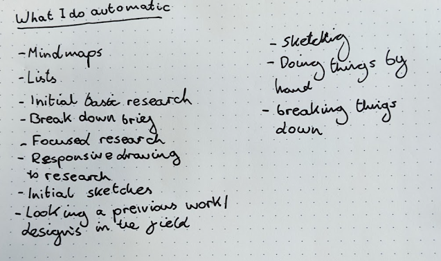
I wanted to create a post for myself that lists all the things that I do automatically when working on a project or producing a piece of design again. I find it ironic that when thinking about what I do automatically the first thing I do is to write a list and I put lists on there, this is something that really helps me and it's become more and more obvious to me the more I do it during this project. Its been so interesting looking at myself like this because I have never done it really nor have I ever noticed all these things I do when working on a project or producing a piece of design, if anything it gives me even more confidence in myself that I felt I lost during this project and have now seemed to regain during this time of looking closer at myself than ever before. I'm glad I decided to do this, as it shows to me how these years have really helped to improve my way of working and how practice can really make a massive difference for someone and help to make them better.

Theory of Practice

Image
 Looking at both my way of producing a piece of design and looking at my past projects I've found myself more and more aware of the amount of practice I have had over these years, working towards briefs and producing graphic design. It reminded me of the saying "Practice makes Perfect" which really applies to my work and the amount of time I've been working on my designs. Time really does help. Thinking about this I decided to google the theory of practice to see if there has been anything written about this.  This is what I found when searching, it is a diagram that attempts to explain how everyday practices are impacted and impact each over to create the social practices. It's an interesting way of looking at the way in which normal people spend their lives and go about each day, this is definitely something I have never thought about before. This is my practice cycle that I decided to create to attempt to explain my own practice. Within I put Research, Learning

My Past Projects - Part 3

Image
 I decided the next project I would look at would be one I felt was one of my strongest projects to ever produce, this was my Major Project for my third year and was the project where I put in everything I learned over my years in education to build a very strong and competent project. One thing I notice straight away that I do differently is I started responding to my research before at all the projects I have looked at I hadn't done this. I had only responded by saying what I like about it or what I had learned from it, I hadn't responded by drawing next to it this drawing is influenced by the research. This I think is what propelled my research further and improved it, I really like this idea of actually responding to the research rather than just typing something that confirms I understand it. Along with this it's a much more fun way to research so why didn't I do this for my other projects, was it because I just hadn't thought about doing it?

My Past Projects - Part 2

Image
 Instead of just looking back at projects that I really like I need to also look back at projects I am not so proud of, I think this is where I can learn the most about myself and see exactly where I feel I went wrong or maybe where I didn't go wrong. A project that I certainly want to forget is from my second year called Ethical Design, in this project we were tasked with creating something that responded to something we believed in. I want to look back at this project and see where I went wrong and what I feel I could have done differently now. I did before looking at the research folder for this project think that the problem with this project was the research however when looking over it again I'm not sure the research is what let me down, I think the research is pretty strong yes there could have been some more bits added to it but its still pretty good. What I notice again is my affinity for using mindmaps and lists as they littered throughout the project again, this real

My Past Projects - Part 1

Image
 I think while it is important to look at how I actually design something, it is also important to look at how I come to design something. To do this I want to look at some of past projects from university and work out how I get to the designing stage, which includes the research stage, ideation, and the lead-up to the final piece. Even me writing this part about what bits I want to look at is a look into my design process stating with research trying to get a base of knowledge about something and then starting to think about how I will take this knowledge and apply it to my designs. I decided to start with a project that personally I am very proud of, in the latter half of the second year we had a project called " live design brief" we were given the choice to pick a brief from a set of competitions being held that year and while I may not have won anything I still feel this project was where my research and designs shined however looking deeper into this project may show to

Drawing Part 3

Image
Here are the pages of some of the drawings I have been doing slowly over the past few weeks. To be honest with you I didn't do as much of this as I really wanted to, but every time I tried to sit down and draw something I would begin to hate it and ultimately stop because I couldnt put what I saw in my head down onto the page. After doing a bit of searching around for how I felt I stumbled upon the Van Gogh fallacy . The fallacy includes an example where it says "Van Gogh was misunderstood and living in poverty, but later he was recognized as one of the world's greatest artists. I am misunderstood and living in poverty, therefore I will be recognized as one of the greatest artists". This acts as a type of wishful thinking and makes the person think that there is a connection that just does not exist, I think I am doing this in part to myself when it comes to my drawing. I am hopeful it will look a certain way and then when I draw it I feel bad because it does not loo

No More Grids

Image
  This time I tried my hardest to design without a grid, going so far as to focus the design itself on "Disregarding grids", much like with the previous design I at first started designing in a grid even if there wasn't one there. However, I caught myself and pushed myself to break this, putting the type at odd angles and working with it in massive size. Along with this I also didn't have a big block of text to design around and ultimately I feel like this made the design process and design overall much worse, I find it so much better and easier to design around a block of text it allows me to understand how the audience is going to look at the design and how the rest of it will sit. Thinking about how I find it easier to design with a block of text on the page and working to a grid has made me start to think about why I feel I need to stop doing this, what is exactly wrong with it? I think it was much more interesting when I was looking at my own methodologies and wh

Continuing my methodologies

Image
  Continuing to investigate my methodologies I decided to make another poster however this time I would try and steer away from using grids, leaning on already comfortable design styles such as swiss design, and just try to push myself further to create a poster in 5 minutes. This is what I created... As you can see I found it very hard to move away from the swiss style of design or even design without a grid, when you watch the video of me designing this you will see that while I didn't first create a grid I feel I still used one, just one that was in my head and forced me to design like this. While I know grids are important and help to make a design more readable and better for the reader I just wanted to see if I was able to do it without and what it would look like. As it turns out I can still design without a grid by creating a grid in my head. I think this is both a good and a bad thing, while I may not be able to let myself go free with my designs at least I know that I hav

Graphic Design Rules - Part 5

Image
The most interesting part of this book is that it says "for no problem is there an absolute solution". This is a really interesting way of looking at something and something I have never thought of before, I have spent most of my education expecting there to be an answer to something and most of the time getting an answer or finding the answer. However, if I relate it to this project there isn't really a set answer for the question we have been given, I have spent most of this project expecting there to be an answer and going in circles never really finding one until suddenly I read this and realize that there doesn't need to be an answer only something that I am happy with. So that is what I will do, I will do something that I am happy with and not worry about it answering the question we have been given. Maybe this is how I should approach briefs from now on, just allow myself to be freer with them. Graphic Design theory: readings from the field. Armstrong, Helen. N

Graphic Design Rules - Part 4

Image
The next book I looked at was this collection of essays and thinkings from the field of Graphic Design, I thought this would be useful for me as it features loads of writings from well known Graphic Designers and would hopefully give me more insights into the theory and how Graphic Designers use their practice in everyday working. Starting right at the start of the book I found the introduction/forward to be really insightful and useful for me to understand, and place within my own workings. If this is what the rest of the book is like then I think this could be a very useful book for me to use throughout this project. The part that most resonated with me is about how students in Graphic Design are now being taught the "how" rather than to use "why", pointing out that students are taught how to use software, solve problems, or get clients. If I think about this quote and put it into my last 3 years taking a BA in Graphic Design here in Portsmouth I think some of it

Project Update - 4 - Confused

 This is now my third project update, before this, I would have said I was confident feeling like I knew what I was doing, what I needed to research, and what it was going to look like. However now after thinking more and more about my manifesto idea, I have decided to throw it out and this has caused me to feel a bit lost again, while I know I want to look more at theory and do something around that I'm just not sure right now. It's tough on me having had what I felt was a good idea a few weeks ago to now feeling like its a bad idea and deciding just to throw it all out, but while writing this I need to remember to keep pushing at it all the way back to the start of this project I felt a bit like this lost and not sure of where to go next. However, I fixed that by just starting and looking at things, in the post where I decided to forget the manifesto I said I wanted to look more at theory so that's what I will do and just start it. I'm sure I'll get somewhere at s

Why a Manifesto - Who is it for?

Image
 See when I started to think more about my Manifesto and what it would be about I began to think if it was actually useful for other people and if it even answered my question, I have these ideas of grandeur that the manifesto will be amazing and solve so many problems. I decided to do a mindmap where I tried to list who exactly the manifesto would be for and if it would even be useful. As you can see I couldn't really put that much down on the page when I tried to think who the audience for the manifesto would be, yes maybe artists would find it interesting but even then would it help them, would it resonate in any way. I'm just not sure it will do that nor now that I think about it will it even be appropriate for the project question, yes some of the manifestos I have read in my research read like theory books and give a new way of thinking but I don't think it works as well. Throughout this research I have found myself more interested in the theory and rule books on grap

Creating my own Manifesto

Image
 Having read all these rule books, manifestos, looking into my own methodologies and attempting to improve my own drawing skills I have decided to try and create my own Manifesto for how I feel we should create Graphic Design and what a Graphic Designer should be when it comes to their own work. I got this idea especially from the "365 rules for Graphic Design" book as I felt that when reading it that it was attempting to box us in and tell us by creating these rules upon rules that we have to follow, this was when I started to think about why we actually need them and that there aren't really any of these rule books for artists and painters so why should we be different.  Maybe our best designs can come from having no rules at all, just being able to create our own designs that we want to.  I found this website from a college in America that outlines how to write a manifesto and what points to follow when writing it, some of the most interesting points they outline are t

Analysing Myself

Image
When I started creating the poster I also decided to record me creating it too, this allows me to look back at my decisions and design choices when making the poster at such a quick pace. It was definitely hard to try and create something in this quickly but I think the time limit forced me to lean on what I have learnt and allowed my methodologies to show themselves properly. Looking through the video I can really see how I quickly begin leaning on these rules and ways of working that I have read about in design books.    The first thing I do is to copy the type in and then lay out a grid system for the design, I first learnt about grid systems in the first year of  my BA. Here we were taught to use a grid system in our designs to effectively lay out a page and have the type look correct and fit into a overarching system, I have already looked at Grid Systems in this  blog  but it is interesting that I have learnt to use this and now almost am unaware I am using it. A page in the desi

My Methodology/Project update - 3

Image
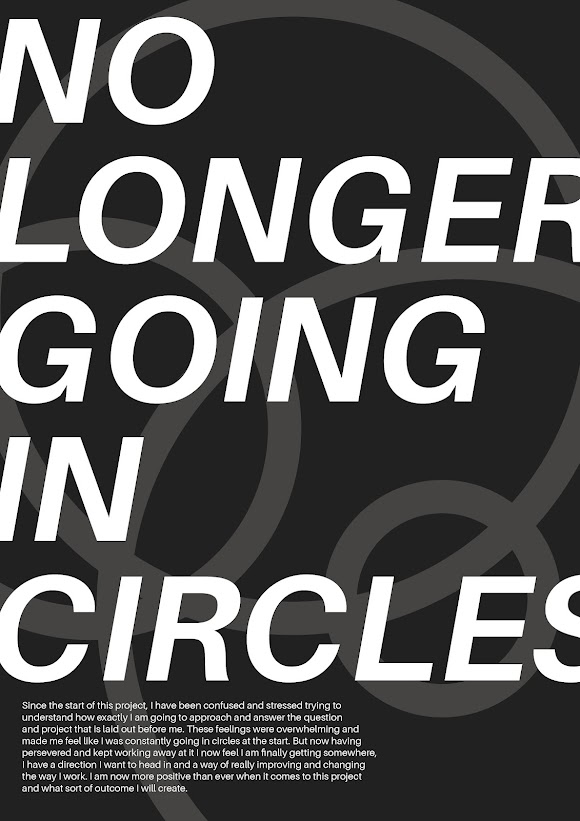
Before starting the poster I made sure to create things that I would need beforehand, all this included was writing a short paragraph that would be included in the poster giving a bit of information about how I'm feeling in relation to the project. This is what I wrote; Since the start of this project, I have been confused and stressed trying to understand how exactly I am going to approach and answer the question and project that is laid out before me. These feelings were overwhelming and made me feel like I was constantly going in circles at the start. But now having persevered and kept working away at it I now feel I am finally getting somewhere, I have a direction I want to head in and a way of really improving and changing the way I work. I am now more positive than ever when it comes to this project and what sort of outcome I will create. This is exactly how I feel about the project currently and it's actually quite nice to have this sort of breakthrough in my thinking to